UX/UI PROJECTS
SLSC St. Leonard's Society of Canada
Overview
I was hired as a limited term UX/UI Designer by SLSC. The goal was to help them plan/design and update their current website to make it more user-friendly, compelling, informative, and accessible. My goal was to also help them identify who their users are, address the needs of the organization and support the development of a design brief for SLSC’s website. My role as a UX/UI designer includes User Research, Information Architecture, Wireframing, Prototyping, and Project Management.
Company
SLSC St. Leonard’s Society of Canada
Duration
3 Months
Roles
User Research, Information Architecture, Wireframing, Prototyping, and Project Management.
INITIAL PROBLEMS
- Outdated website
- Plan/design and update their current website to make it more user friendly, compelling, informative, and accessible.
- Lack understanding and information about who their users are.
- Client (SLSC) ‘s concerns.
- Support the development of a design brief.
- Update and expand on current digital communication practices to develop long-term outreach and branding strategies to raise SLSC’s national profile, promote its publications, and strengthen its relationship with its membership and the public.
- Update and expand on content style guides, content and messaging strategies, promising practices, and processes.
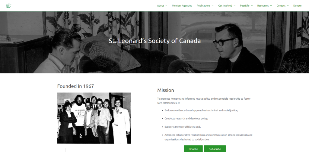
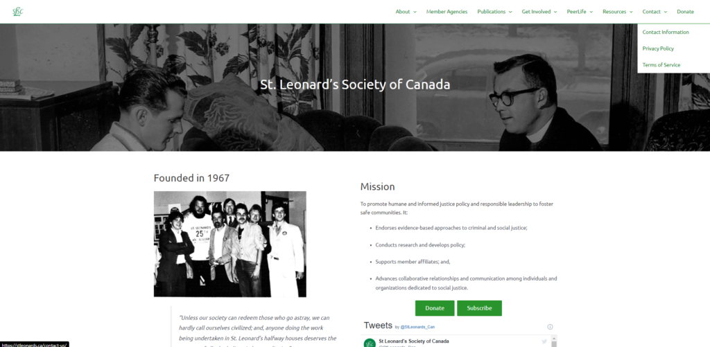
BEFORE
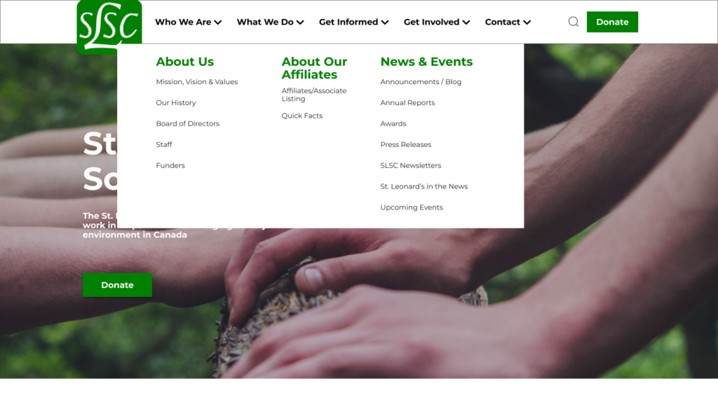
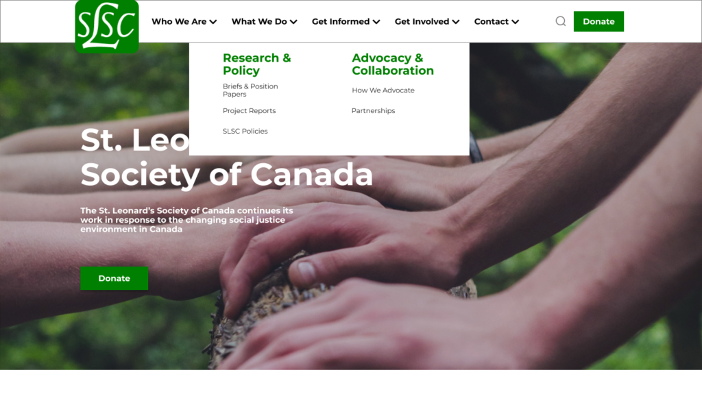
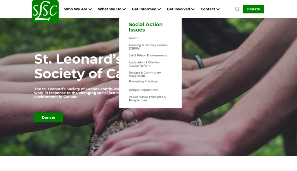
AFTER
Home Page (Before)
Home Page (After)
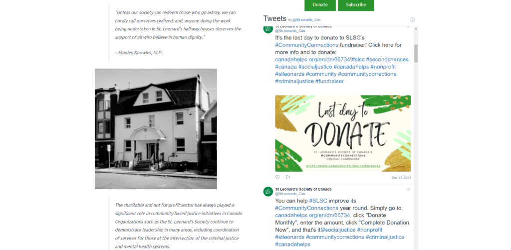

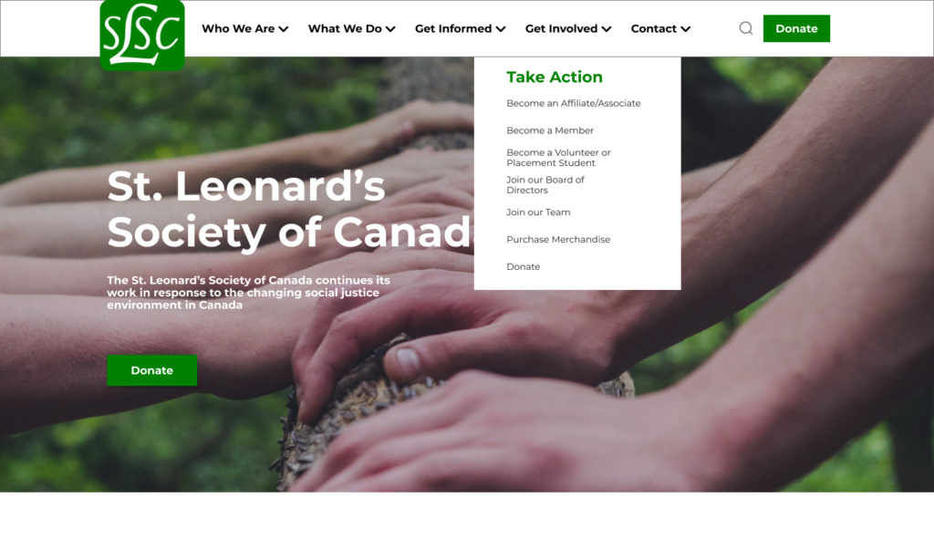
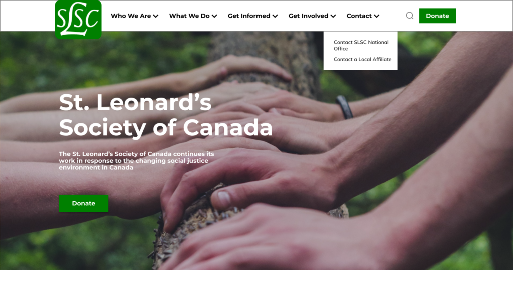
Menu Bar & Sub Menus (Before)
Menu Bar & Sub Menus (After)
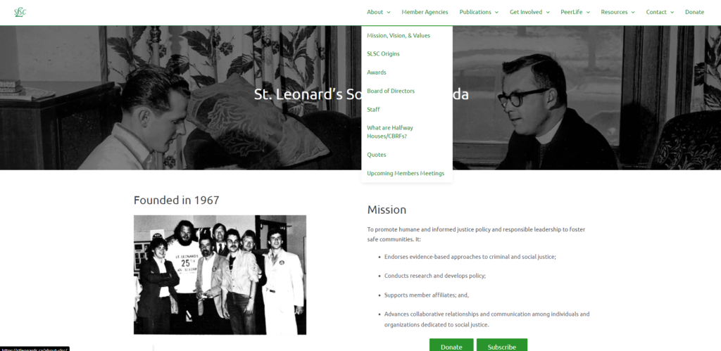
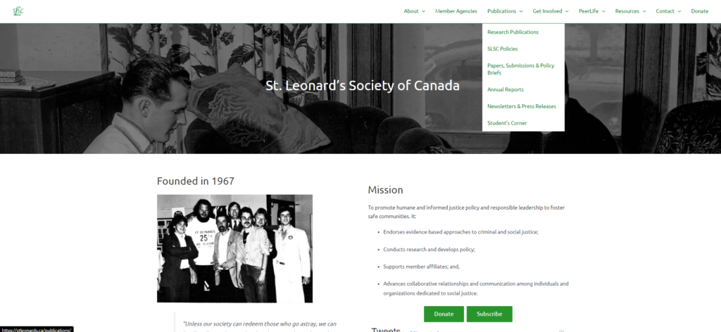

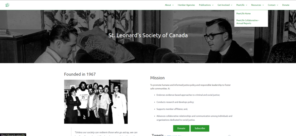
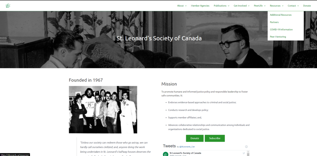
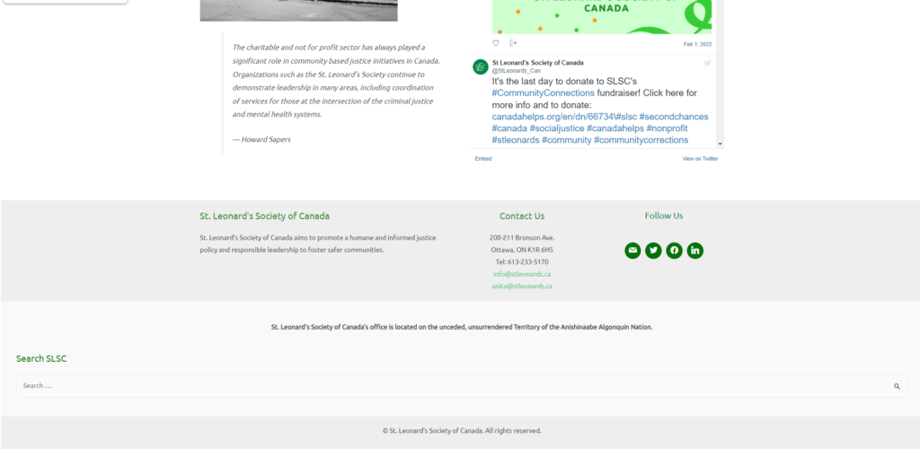
Footer (Before)
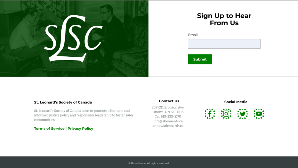
Footer (After)
Other Pages (Before)
Other Pages (After)
PROCESS
01
DESIGN BRIEF
I had a meeting with the client(SLSC team) consulting them about the project deliverables, scope of the project, and gathering information about the organization’s background.
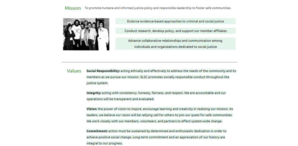
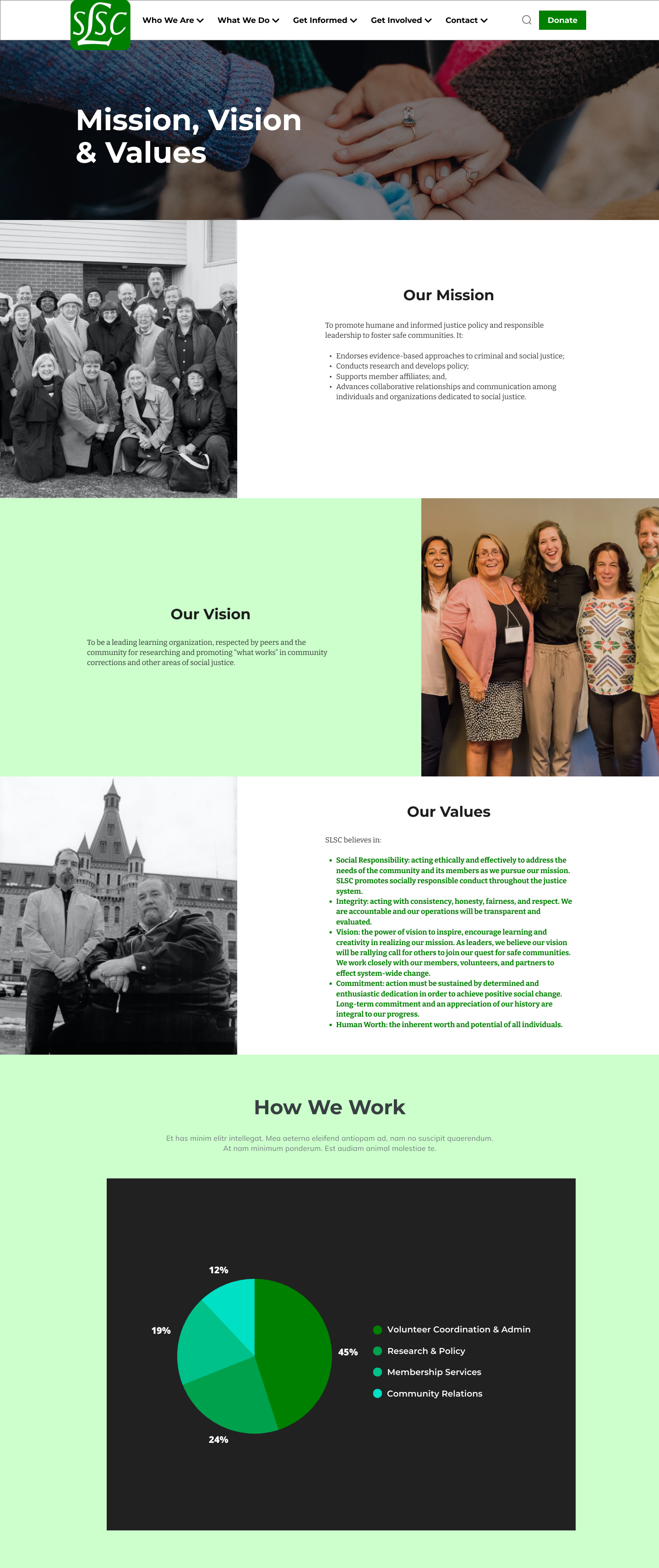
Finding out their mission, vision, & values in order to empathize with the client and their users.
02
USER RESEARCH
My goals for this research are:
– To learn and identify who the users are and learn their motivations in using the website.
– The website’s needs in order to achieve the client’s goal
– To document the pain points and needs of the website and lists solutions/ideas
– Is the website meeting the user’s needs?
03
INFORMATION ARCHITECTURE
This phase is where I organized the data and information I’ve gathered.
Techniques I used:
– Affinity Mapping
– User Flow
– Site Map
Information I gathered:
– Insights (Pain points & needs)
– Analysis (Solution/Ideas)
– Competitor Analysis
– Ideate (Key Features)
04
WIREFRAMING
I showed them the basic structure and the visual design of the end product.
– Low Fidelity Wireframes
– High Fidelity Wireframes
05
PROTOTYPING
I present to my client a visual representation of the end product and how the website functions. This stage is also where I created the project hand off for my website developer. This phase is important to me because this will help me have a smooth transition from my UX/UI design work to our web developer.
USER RESEARCH
THE USERS:
- Different types of donors
– Individual Donors
– Major Donors
– Corporate Donors
– Foundations - Agencies/Organizations who want to partner, contribute, or fund a research project
- Potential placement students/volunteers wanting to find out more about SLSC
- Students or academics/professionals wanting to find out more about SLSC
- Students or academics/professionals looking for research/materials on various topics
USER PERSONA
INDIVIDUAL DONORS
Procrastinator
Who they are:
The procrastinator really would like to donate but never quite gets around to it. There’s always something that needs to be done before they can really donate. Maybe it’s finding the right charity or picking how much to donate. Maybe they should put it in savings for now but they are going to donate sometime later for sure
Motivation/Needs:
They will donate but always need something to happen before they can really donate.
Solution:
A CTA donate prompt right away when they visit the site
Charity data collector
Who they are:
The charity nerd loves data and research and spends countless hours looking at different charities and learning more. They drool over detailed information and often can list way more facts than other people know (or want to know) about the charities they are donating to.
Motivation/Needs:
Data and information before they take action
Solution:
Show who we are, how we do things, and our success stories
Peer pressured donor
Who they are:
The peer pressured donor tends to donate when they are pressured to. Whether it is by a door-to-door fundraiser or a group of friends that is also donating. They tend to look towards others to make sure they are making the right choice and check that others think it’s a good call.
Motivation/Needs:
They tend to look towards other people before taking action
Solution:
- Show any records of people who supported
- Show stories of how the program helped other people
Rationalizer
Who they are:
The rationalizer comes up with dozens of excuses why not to donate. They might be concerned that aid is dead or that charities don’t make a real difference.
Motivation/Needs:
Concerned that the aid is dead or the charities don’t make a real difference before taking action
Solution:
- Updated Newsletter
- Make sure that the buttons are functioning and website is updated
- Show the difference our program made through success stories and people we helped
Time-effective donor
Who they are:
The time effective donor wants to make a difference but unlike the charity nerd does not want to spend a lot of time doing it. They are busy with other projects and activities. They want to make a quick donation to a good cause without having to spend hours picking the best cause.
Motivation/Needs:
Straight to the point and does not want to waste time. They want to make a quick donation to a good cause without having to spend hours picking the best cause.
Solution:
- Emphasized donate button
- CTA prompt
First time donor
Who they are:
The first time donor may be new to the charity sector or new to donating. They are unsure of where or maybe even how to donate they likely do not have a chosen charity yet and might be unsure which of the above categories they fall into yet but are interested in learning more.
Motivation/Needs:
Unsure about the charity and how to donate.
Solution:
- Make sure that they have everything they need in the homepage
- Who the organization is
- How to donate and how it works
MAJOR DONORS
Who they are:
Major donors rarely happen overnight. They might take years of cultivation, but once they decide to give, they give in large sums. Some may have the capacity to give a large sum annually; some may give only strategically when you are doing a special campaign.
Cultivation and stewardship are important to major donors. They don’t want to be “sold to,” but they also want to be kept apprised of what your organization is doing–i.e., how you’re using their donation.
Motivation/Needs:
- What your organization is doing
- How you’re using their donation
Solution:
- Showcase about,what, and success stories
- Show the programs
CORPORATE DONORS
Who they are:
Corporate donors require a completely different approach than individual and major donors. Although they certainly do exist, few corporations give large donations simply to be philanthropic. They expect certain marketing opportunities from their donation–a press release announcing a significant gift, a check presentation photo sent to the papers, naming of a key area in the building to which they’re giving, publicity for sponsorship donations before, during and after an event.
Motivation/Needs:
Marketing opportunities, press release announcing a significant gift, and publicity
Solution:
- Publicity on the website
- Sponsors section with their logo
- Help them understand our organization’s mission.
FOUNDATIONS
Who they are:
Private foundations are pots of money set aside by a person, family or other entity for donation purposes. They typically fall under tax-free IRS laws which, for the tax-free status, require them to give away a certain amount of money–typically a percentage of the income or the principal of the fund itself, depending on how it’s set up–each year. To do that, they often target types of charities they’re interested in and open a grant proposal round once or twice a year during which organizations can appeal to them for funding.
Foundations often prefer to fund programs that actually result in accomplishing the mission of the organization. Few foundations offer funding to capital campaigns, and fewer tend to offer funding of general operating funds for the day-to-day business of the organization. Most require a post-grant report to give them the measurables that show how their funding helped you accomplish your mission.
Motivation/Needs:
Often prefer to fund programs that actually result in accomplishing the mission of the organization.
Solution:
Show the results of the program
AGENCIES/ORGANIZATIONS
Who they are:
They look around first and see what the program has to offer. They take action once they see a familiar organization has already dealt with the program
Motivation/Needs:
If the program is trustable
Solution:
Show affiliates and other organizations you’ve worked with
USER INTERVIEW
I asked couple of people to examine the current website and gather their initial thoughts and opinions about it.
Insights:
- The black and white photos/images gave them the impression that the website is vintage/old.
- They thought that the website is all about church or religion.
- They were unsure about the purpose of the website
- Random contents and insignificant body of texts made them confused
- They mentioned that some of the buttons were not functioning and just takes them back to the current page
INFORMATION ARCHITECTURE
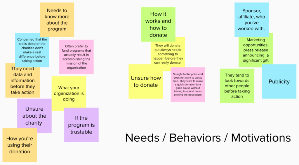
AFFINITY MAPPING
INSIGHTS (PAIN POINTS & NEEDS)
The Affinity Mapping provided me with the following insights about my user’s behaviour, needs and pain points.
USER:
- Users need to know more (data & information) about the program before taking action. They are curious about the organization.
- Users can’t immediately figure out what the website/charity is all about
- Users are unsure about the program whether they’re trustable or not.
- Users are concerned whether the aid the charity is giving is dead or can actually make a difference.
- Users want to see the results and if the program can actually accomplish their mission.
- Users are unsure how to donate.
- Users do not want to waste time and want to make a quick donation.
- Users want publicity, marketing opportunities, and announcements about their significant gift.
CLIENT:
- Diversity (Danielle’s concern)
- Avoid religious impression (not a religious group) (User Interview – I asked my friend for their insight about the website and she said that she thought the website is all about church) (David’s concern)
- Mission – humane and informed ( Research based ) Also linked to looking vintage problem (David’s concern) (Danielle & David)
- Theme of the website (Vintage look) (David’s concern)
- Clustered taskbar and menus (Danielle’s concern)
- Misinformation on homepage “about us” paragraph
ANALYSIS (SOLUTION/IDEAS)
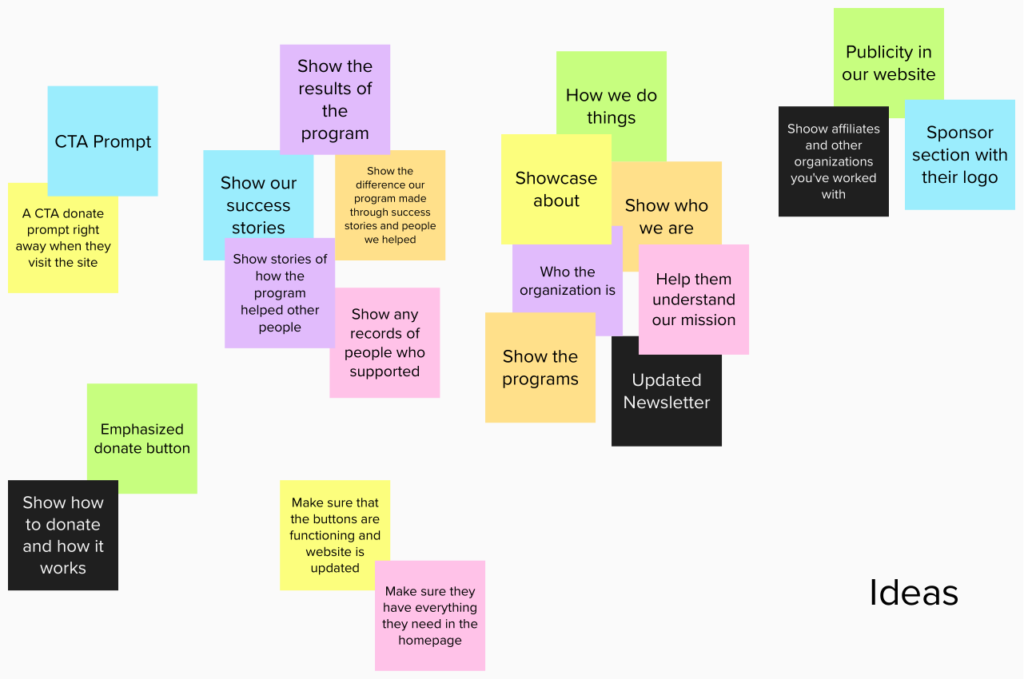
Analysis of the pain points/needs of users and clients and insights from the Affinity Mapping I did for ideas.
USER:
- A CTA donate prompt right away when they visit the site. (Make sure the donate button is functioning)
- Make sure they have everything they need on the homepage.
- Showcase who the organization is, how we do things, and show our programs to help them understand our mission.
- Showcase updated newsletter to show that the charity is alive and accomplishing the goals we have set.
- Show the results of our program such as, success stories, how the program helped other people, and any records of people we’ve helped
- Emphasized donate button for users who are unsure how to donate.
- Create a section for publicity on the website. Have their logo posted in the sponsor/affiliate section.
- A CTA sign up for updates/ subscribe prompt at the the bottom of the page
CLIENT:
- Users can’t immediately figure out what the website/charity is all about
- Show who they are.
- Create another page for read more from home page to about. (David’s concern. He wanted more pages rather than the trend of scrolling)
- Diversity (Danielle’s Concern)
- Diverse photos of community
- Theme of the website (Vintage look)
- Green overlay on black and white pictures
- Mission – humane and informed ( Research based ) Also linked to looking vintage problem (David’s concern)
- Can be conveyed through the design and the theme of the website.
- Some example of the work you’ve provided
- Clustered taskbar and menus (Danielle’s concern)
- Check out the reference Dannielle provided
- Fix the copyright or completely remove the wrong info
USER FLOW
Goals
- User wants to make a quick donation

- User wants to learn more about the organization

- User wants to see if the charity/organization is not dead and making progress

- User wants to see how their money is being used and looking for the results the organization has accomplished

- User wants to see organizations & companies you’ve worked with. Wants to see if their donation/support is being publicized

- User wants to keep in touch and follow the steps the organization is doing

THE PROBLEMS WITH THE MENU AND SUB MENUS
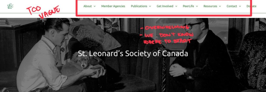
- The taskbar is too vague. The most important rule of web design is that you must not confuse the user.
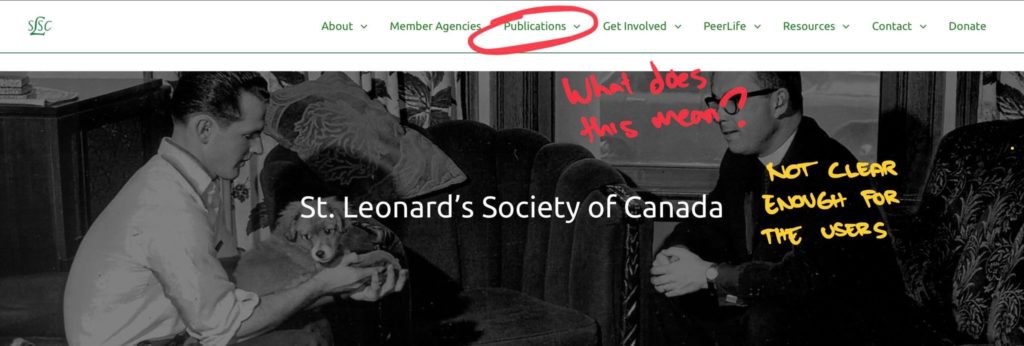
- Yes it’s clear for the people who work in the organization what this publication is all about but it’s very confusing for new users, new comers (students/professionals/donors/ etc) who’re coming here to learn what the website is all about.)
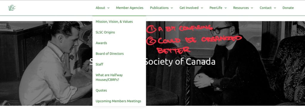
- A bit confusing
- Could be organized better
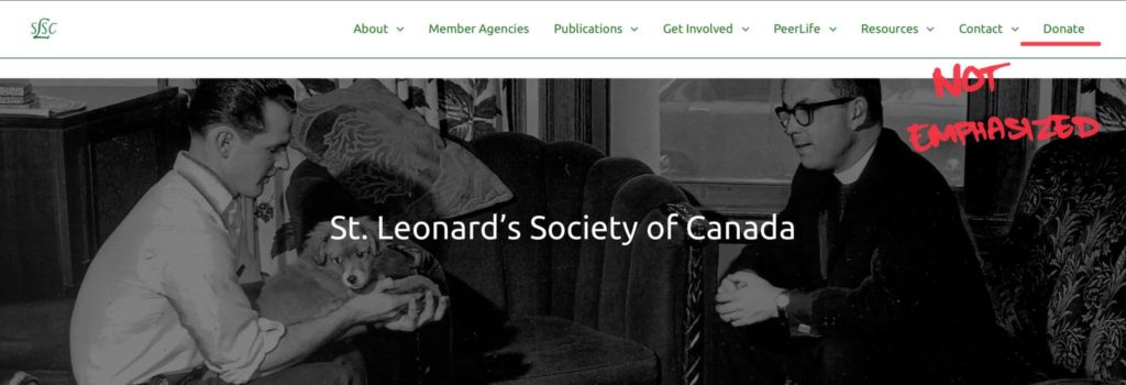
- Donate button is not emphasized.
MY OBJECTIVE
- So I want to show them what the story of our organization is. By creating the “who we are” and “what we are” in the navbar. To effectively solve the confusion problem but also showing our work. Remember our goal is to increase the effectiveness of the website and actually drive the users to make a donation in order for us to make a difference. And we do that by showing our impact in our community.
- Another goal is to make the navigation of the website flow better. For newcomers(students/professionals/etc) to understand our content easier by making the experience better and not frustrating.
- And if we look back to our main problem. This is exactly the problems we are trying to solve in the first place
SOLUTION (COMPETITOR ANALYSIS)
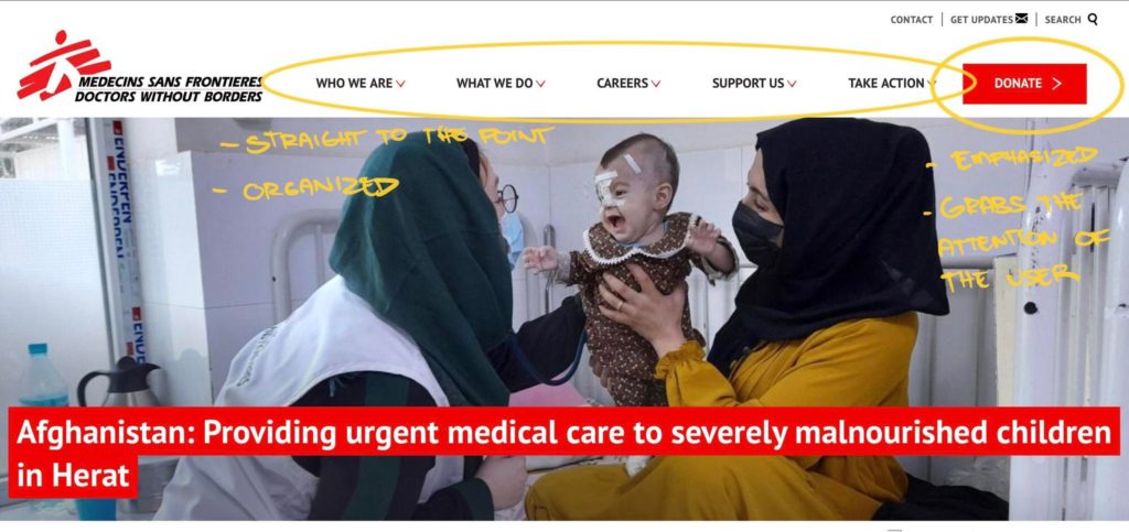
- Straight to the point
- Organized
- Emphasized donate button
- Grabs the attention of the user
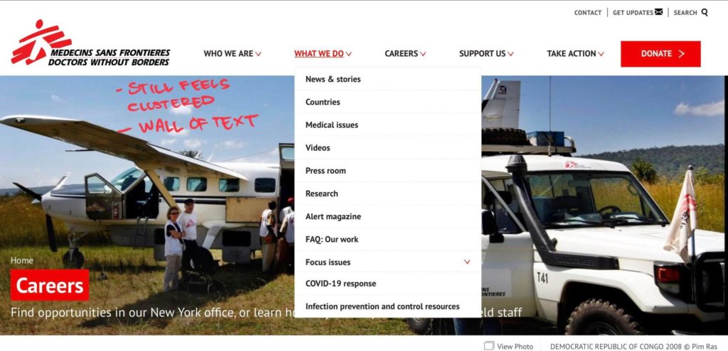
- It’s okay but still feels clustered
- Wall of text
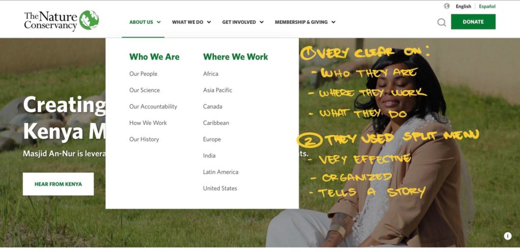
- Very clear on:
- Who they are
- Where they work
- What they do
- They used split menu
- Very effective
- Organized
Will also be using split menu for our SLSC site
SITE MAPS
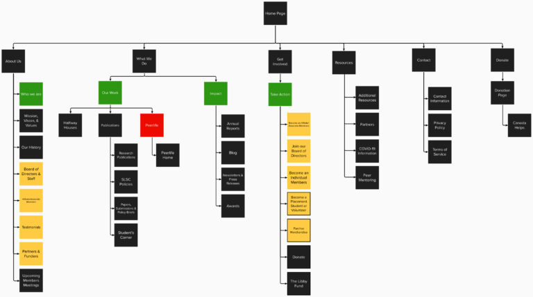
Revised Site Map #1 (Based on the feedback/comments in google doc)
- Combined “Board of Directors” and “Staff” together
- From “Quotes” to “Testimonials”
- Added “Affiliate/Associate Members” and “Partners & Funders” under About us
- Change from “Affiliate/Associate Members” to “Become an Affiliate/Associate Members”
- Change from “Individual member” to “Become an Individual member”
- Change from “Board Members” to “Join our Board of DirectorsMembers”
- Change from “ Placement Students” to “Become a Placement Student or Volunteers”. Combined together
- Removed “Volunteers”
- Added “Purchase Merchandise”
- Removed “Simply K”
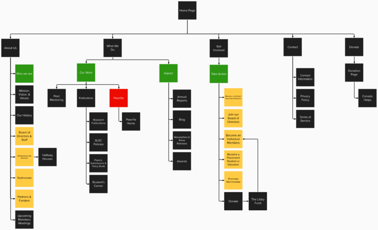
Revised Site Map #2 (Based on the meeting with Danielle)
- “Halfway houses” moved inside “Affiliate/Associate Members” under “Who we are”
- A link inside “Affiliate/Associate Members” that shows the infographic of halfway houses
- “The Libby Fund” moved inside “Donate” under “Take Action”
- Has a link that goes to “Become and Individual Member”
- Removed “Resources” from the navbar
- Moved “Partners” to “Partner/Funders” under “Who we are”
- Moved “Peer Mentoring” under “Our work”
- “Peerlife” is still not finalized whether we’re removing it or keeping it.
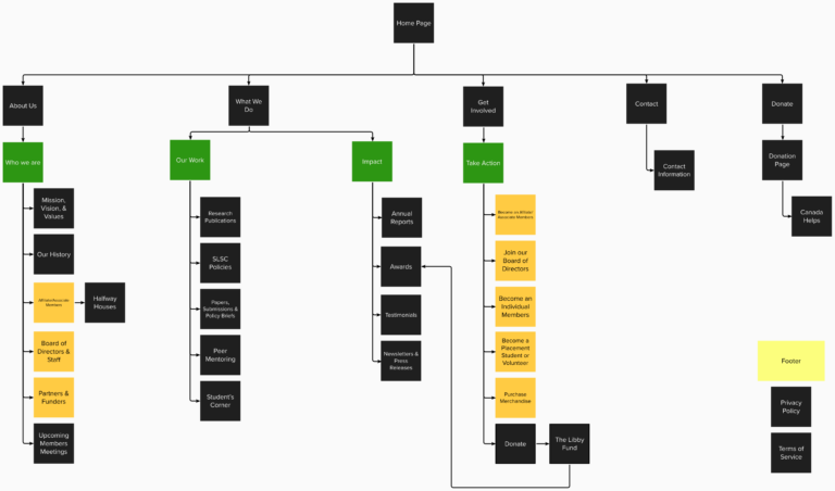
Revised Site Map #3 (Based on Danielle’s comments in google doc)
- – remove ‘testimonials’ as a page; integrate those quotes into the home page
- – I think under ‘Our Work’ you could delete the sub-headings ‘Publications’, as well as ‘PeerLife’ as PeerLife will be located on a different site entirely (as you’ve indicated with it being listed in red). That would have everything under one list of ‘Our Work’, which ‘Peer Mentoring’ could fall under.
- – Rather than connecting ‘The Libby Fund’ to ‘Become an Individual Member’, it should connect to ‘Awards’. Also, the Libby Award will be explained on the donation page rather than having its own page
- – Just to be sure, is it most logical to put ‘Privacy Policy’ and ‘Terms of Service’ under ‘Contact’?
- – This is just a small thing, but I think where logical, list the items in alphabetical order (e.g. keep ‘Mission, Vision, and Values’, and maybe ‘Our history’ at the top of ‘Who We Are’, then list the rest alphabetically
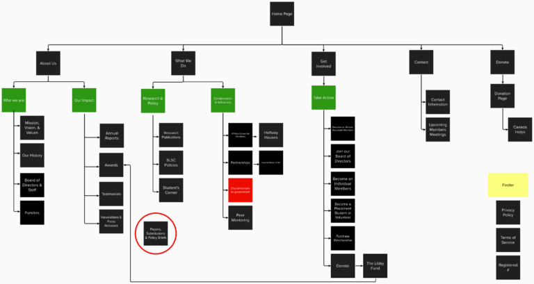
Revised Site Map #4 (Based on Anita’s feedback) (March 16, 2022)
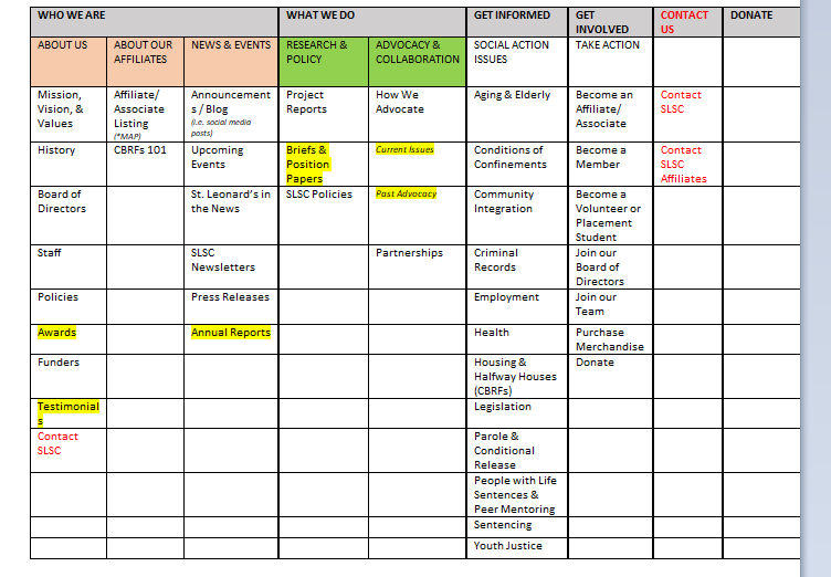
Revised Site Map #5 (Based on Anita & Danielle) (Received via email on March 24, 2022)
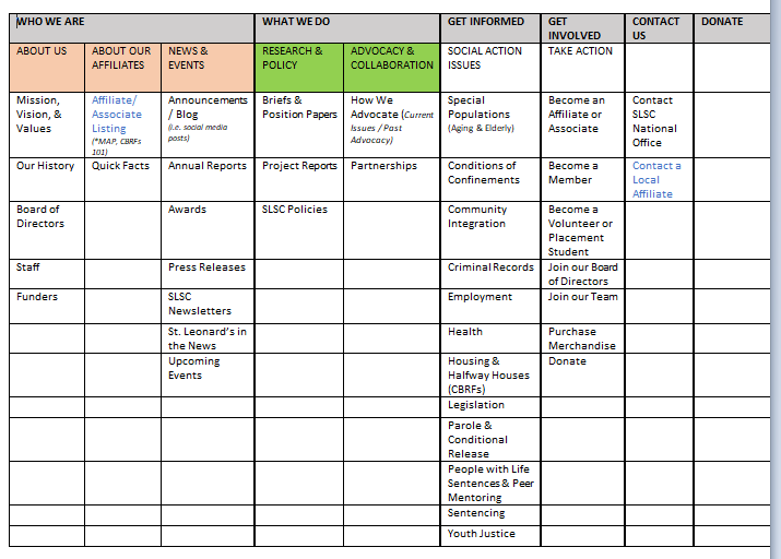
Revised Site Map #6 (Based on meeting with David, Anita, & Danielle) (March 28, 2022)
FINAL SITEMAP
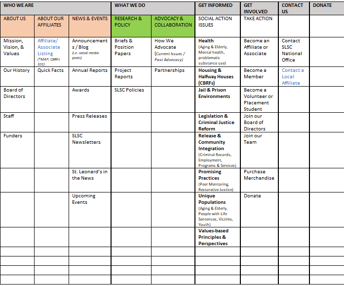
The sitemap had a good deal of iterations due to having 3 different bosses that had different personalities and schedules which resulted to different insights and conflicting ideas. Another reason was the process of improving the website’s content along the way.
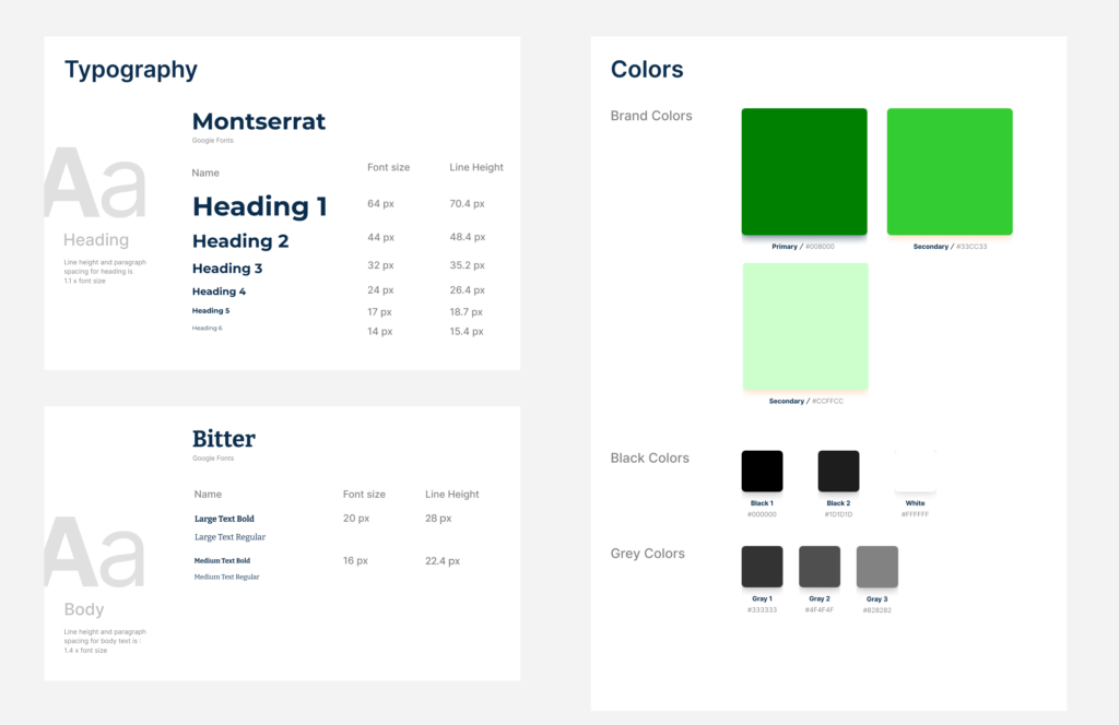
STYLE GUIDES
WIREFRAMES
SKETCHES
Started sketching out ideas and designs I envisioned of how the website will look like. These ideas are based on user/market research and clients’ input.
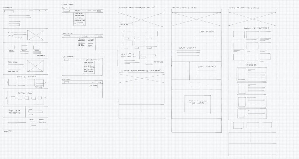
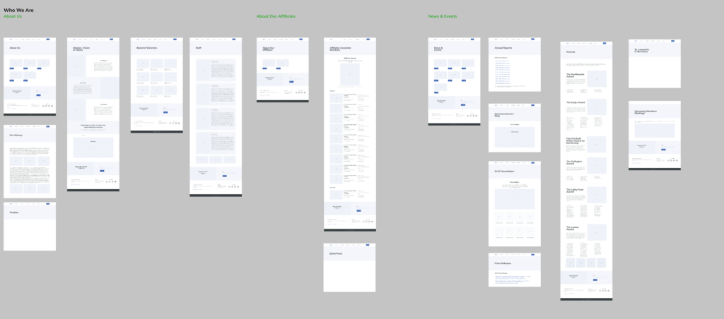
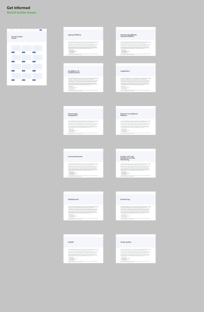
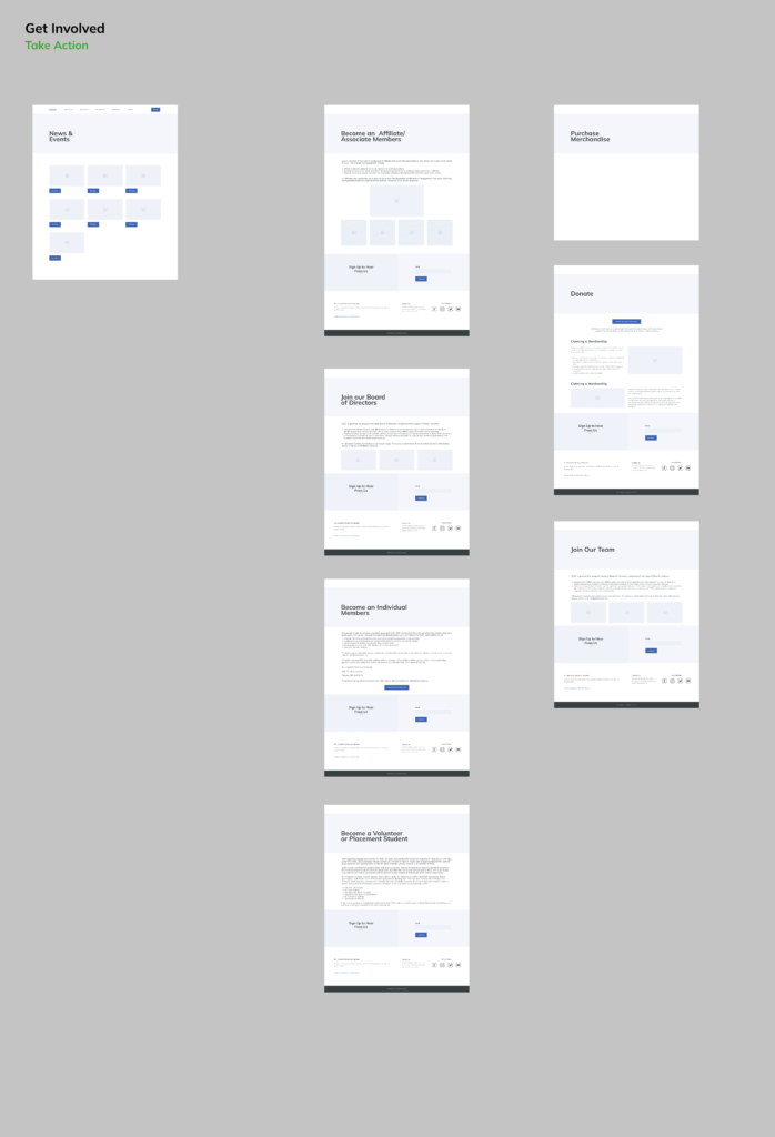
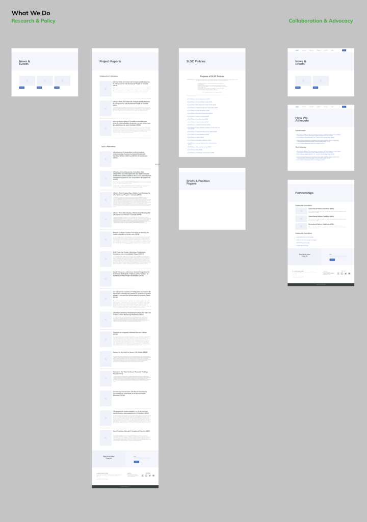
LOW FIDELITY
This is what I presented to my clients which immediately helped them visualize the final product. Any changes were applied during the process.



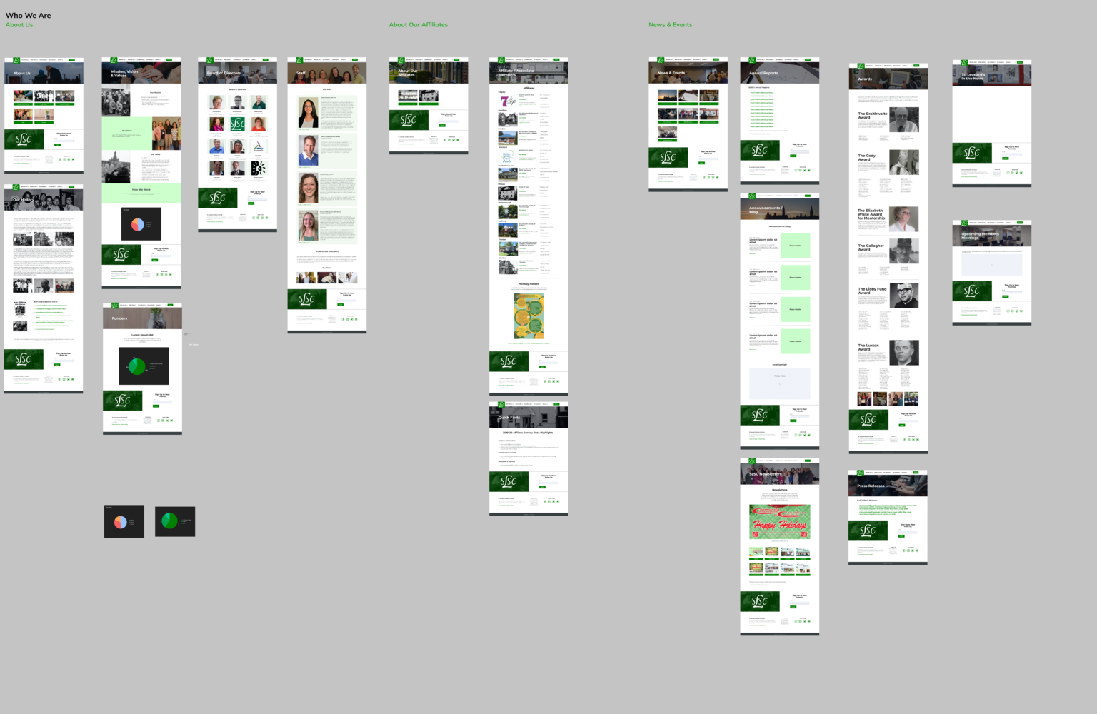
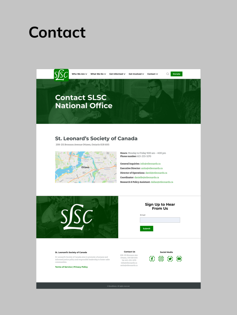
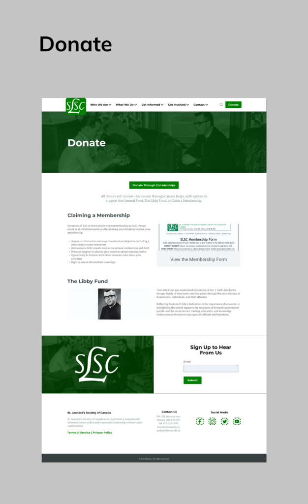
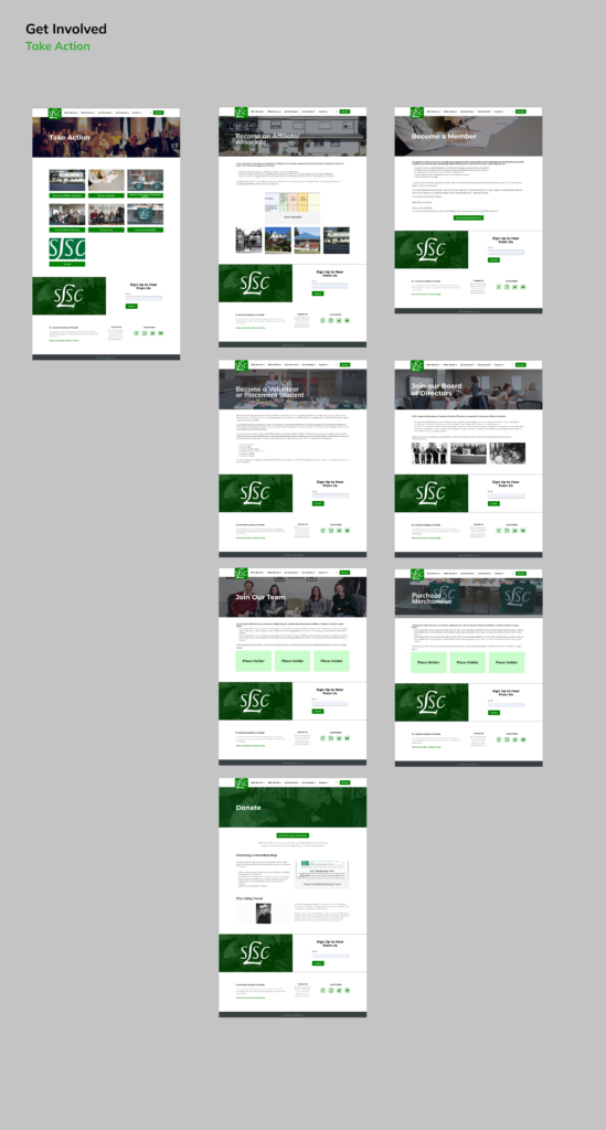
HIGH FIDELITY
The style guides were applied during this phase and this will be the final product that the web developer will use as a reference when building the website.



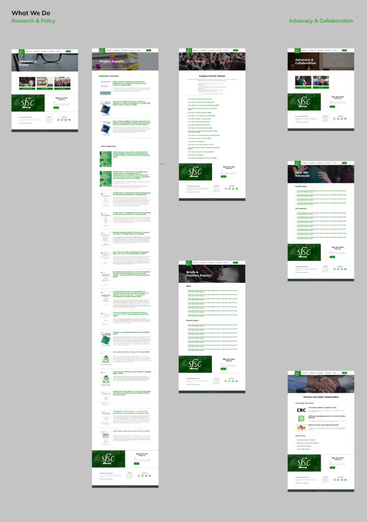
PROTOTYPE
This is the final product which shows the website functions. If you want to play around with the actual prototype click here.
THANK YOU!
Please look at my other projects
The client (SLSC team) was really pleased and impressed with the outcome and the work I’ve done for them. They have expressed their gratitude towards my work for them and said,
