GRAPHIC DESIGN
LOGO CREATION
Overview
I do commissioned logo design works on the side. Here are some of my works that showcase the logos I created based on my clients’ requests and design briefs.
Company
JCMAGSINO
Duration
Client needs
Roles
Graphic Design
PROCESS
01
CREATIVE BRIEF
I had a meeting with the client, consulting them about the project deliverables, scope of the project, and gathering information about the their brand identity.
Finding out their mission, vision, & values in order to empathize with the client and their users. Important information such as, their goals, products, and target audience.
02
RESEARCH
My goals for this research are:
– to find out the kind of field their brand stands in.
– Prominent color palette/schemes in their industry.
– Study the industry.
– Compare logos from within the same industry as my client’s.
03
IDEATE
This phase is where I organize the data and information I’ve gathered from my client. It is also the stage where I translate the emotions and words into colors, imagery, and feel which will set the tone of the design. I use the technique called moodboard to achieve this.
04
SKETCH
Combining all the elements associated with the client’s brand. Sketching out concepts based on the information we’ve gathered.
05
DIGITIZE
This stage is where I pick out the once that I think looks great and aligns the best with my client’s product. I create them by vectorizing them in Adobe Illustrator. Another important step here is finding out the right typography.
06
PRESENT
I prepare the the final logos and present them to my clients. This is where we discuss about the logo, the reasoning behind and where I encourage the client which one fits best. Taking notes is crucial here. As they give you important insights and feedback that you can use on the next step.
07
REFINE
The next step is refining. I use the information I collected from the previous discussion and apply it here. Consider the pain points you’ve collected and revise the logo accordingly.
08
DELIVER
Delivering the final result. Putting together the file formats in one folder to deliver to the client. The folder includes:
- .ai vector files for sizing and future editing
- .jpeg for viewing
- .png for transparent bg
- .pdf for printing
TINDAHAN T.O
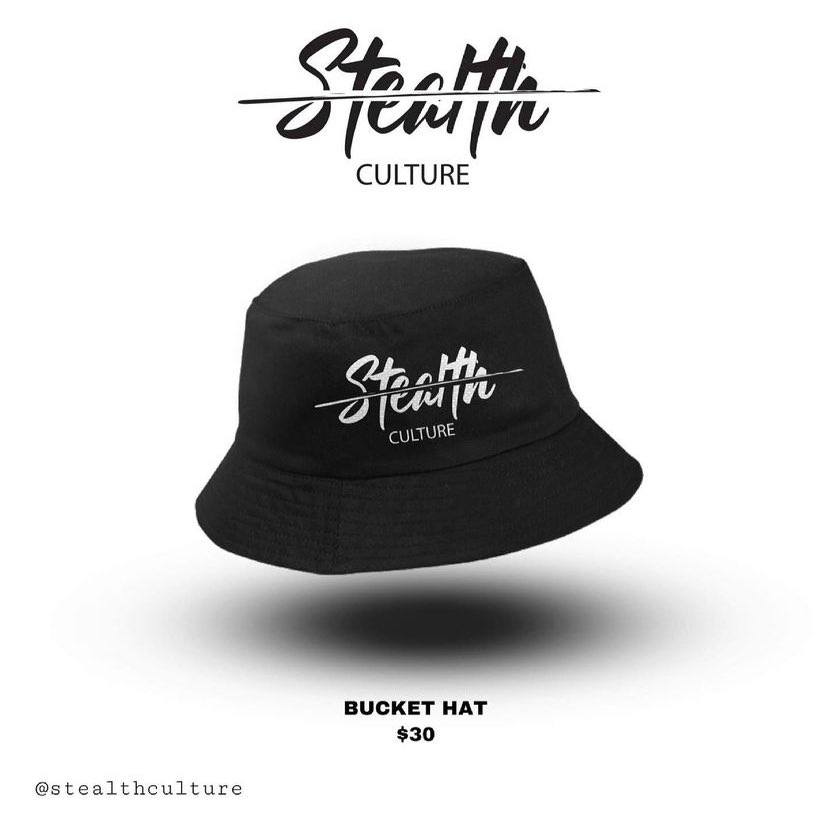
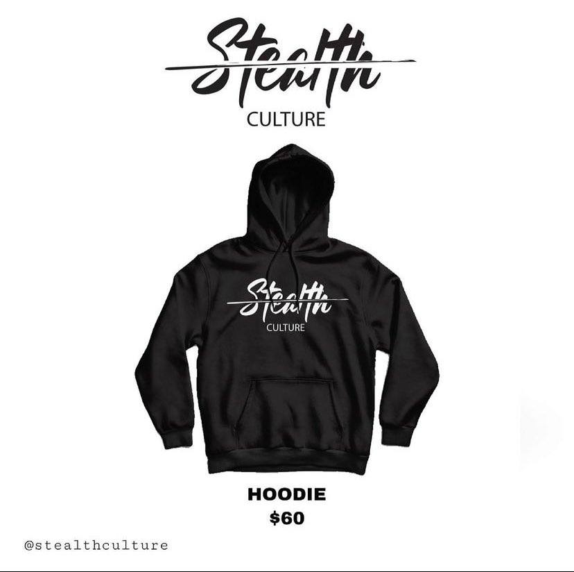
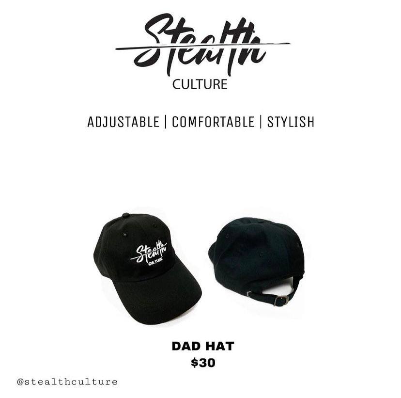
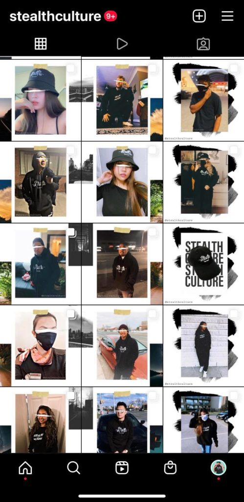
STEALTH CULTURE
FINAL LOGO
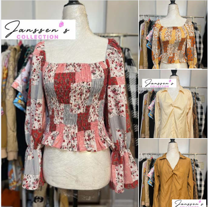
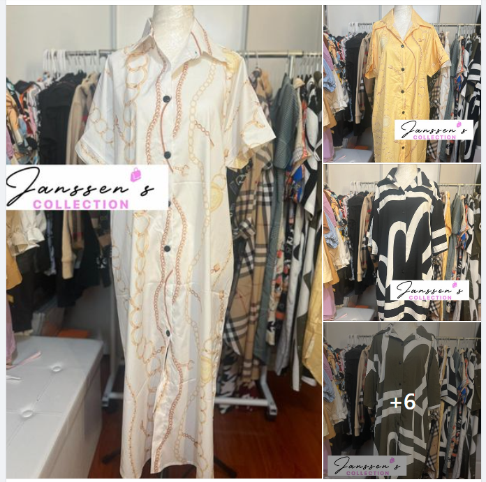
JANSSEN'S COLLECTION
LOGO CONCEPTS

FINAL LOGO CHOSEN BY CLIENT

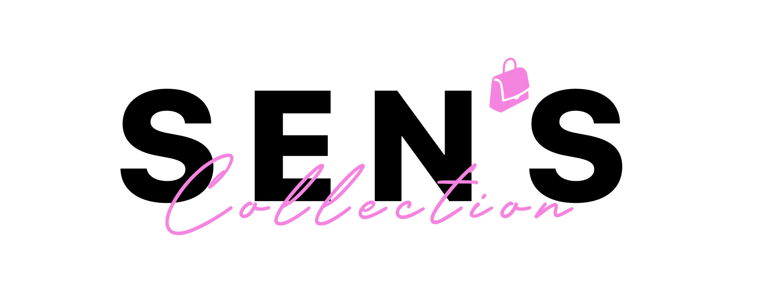
LHEN'S CLOSET CA
LOGO CONCEPTS

FINAL LOGO CHOSEN BY CLIENT
ROYAL LEPAGE
INTERVIEW TEST
This one is from an interview test I did recently for a graphic design position. We were asked to create a logo for their upcoming project called “Terra Realty”. There were hundreds of applicants but only 10 people were called for the second interview based on the logos we created. I was one of the 10 people who got the second interview and this is the logo I created for them. I unfortunately declined this job offer as the hiring process took longer and I was already hired as a UX/UI designer in another company which is why I did not take this job. Anyways I had fun doing this project and creating the “Terra Realty” logo as the thought process in creating it was really engaging and perfectly fits the goal of Royal LePage.
CHALLENGE
You need to make a sample image for “Royal Lepage Terra Realty“. Royal Lepage Logo (Attached in this email) would be the same but “Terra” needs to make a unique style. Please make sure that you can use your own unique idea, design technique to make the “Terra” word design after Royal Leage Icon in a different way like mentioned sample image for Ignite, Atlantic, Platinum and Flower City.
FINAL LOGO
VERTICAL FORMAT TWO LINES
HORIZONTAL FORMAT ONE LINE

BLACK COLOR FORMAT

